026: Spotlight on Case Study Seven
Semiotics for Designers and Illustrators book newsletter #26
This newsletter spotlights case study seven, the first case study in the final part of my book on the theme of visually applying Semiosis (Charles Sanders Peirce’s theory of semiotic sign-action).
This case study is the second one that focuses on the Eilidh Reid’s illustration system when she worked for international branding agency How&How. In Semiotically Wombling Free - Successfully Navigating the Minefield of Creative Decisions the case study’s main subject is How&How’s design team’s rebranding of The Wombles.
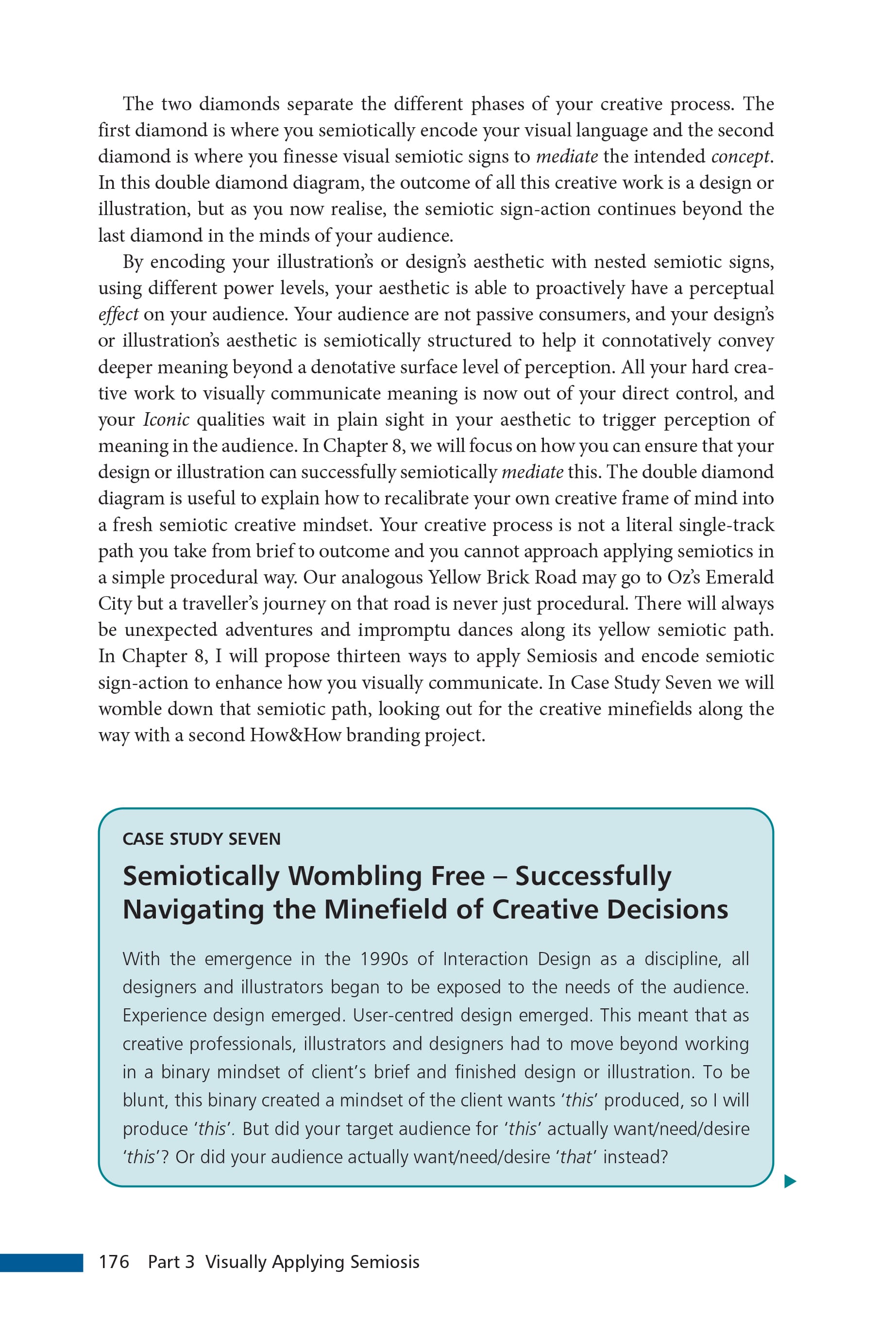
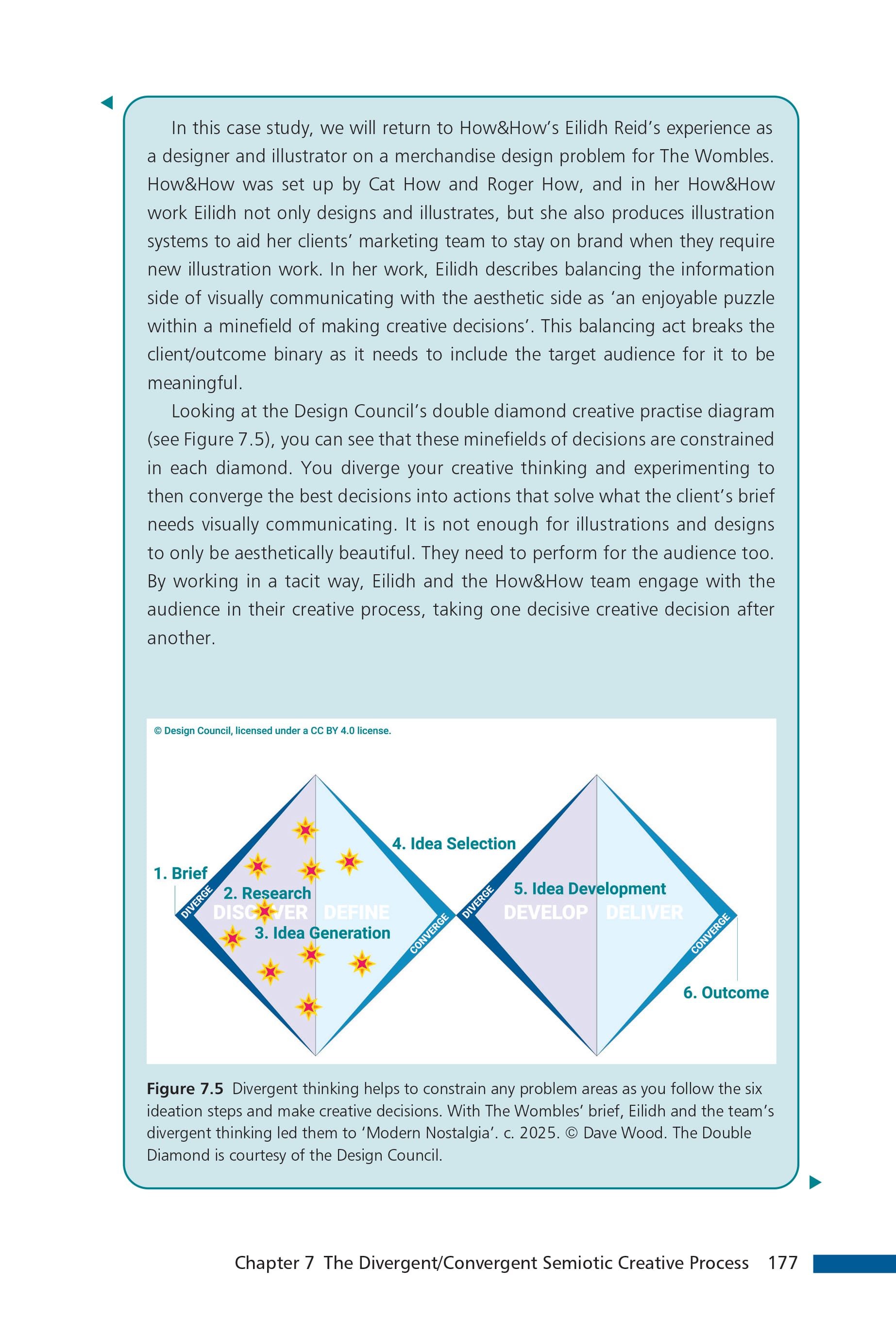
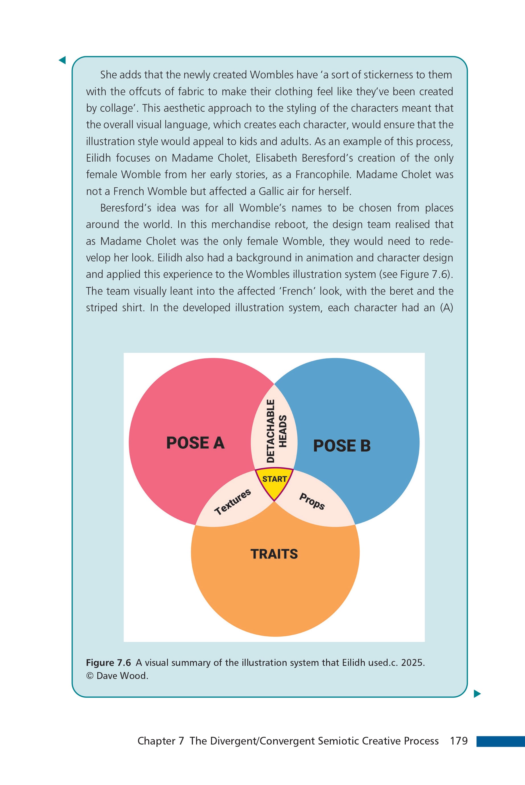
Three sample pages from case study seven showing some of the new diagrams to explain the semiotic theory within practice.
For the uninitiated, The Wombles are subterranean creatures who recycle discarded rubbish on London’s Wimbledon Common. Originating as a range of children’s books written by Elisabeth Beresford, The Wombles have had several TV incarnations as BBC stop motion animated stories in the 1970s, and then later as a 3D cartoon. The rebrand of The Wombles was to capture the complexity of nostalgic children of the seventies and their savvy 21st century progeny, bridging these two audience’s expectations.
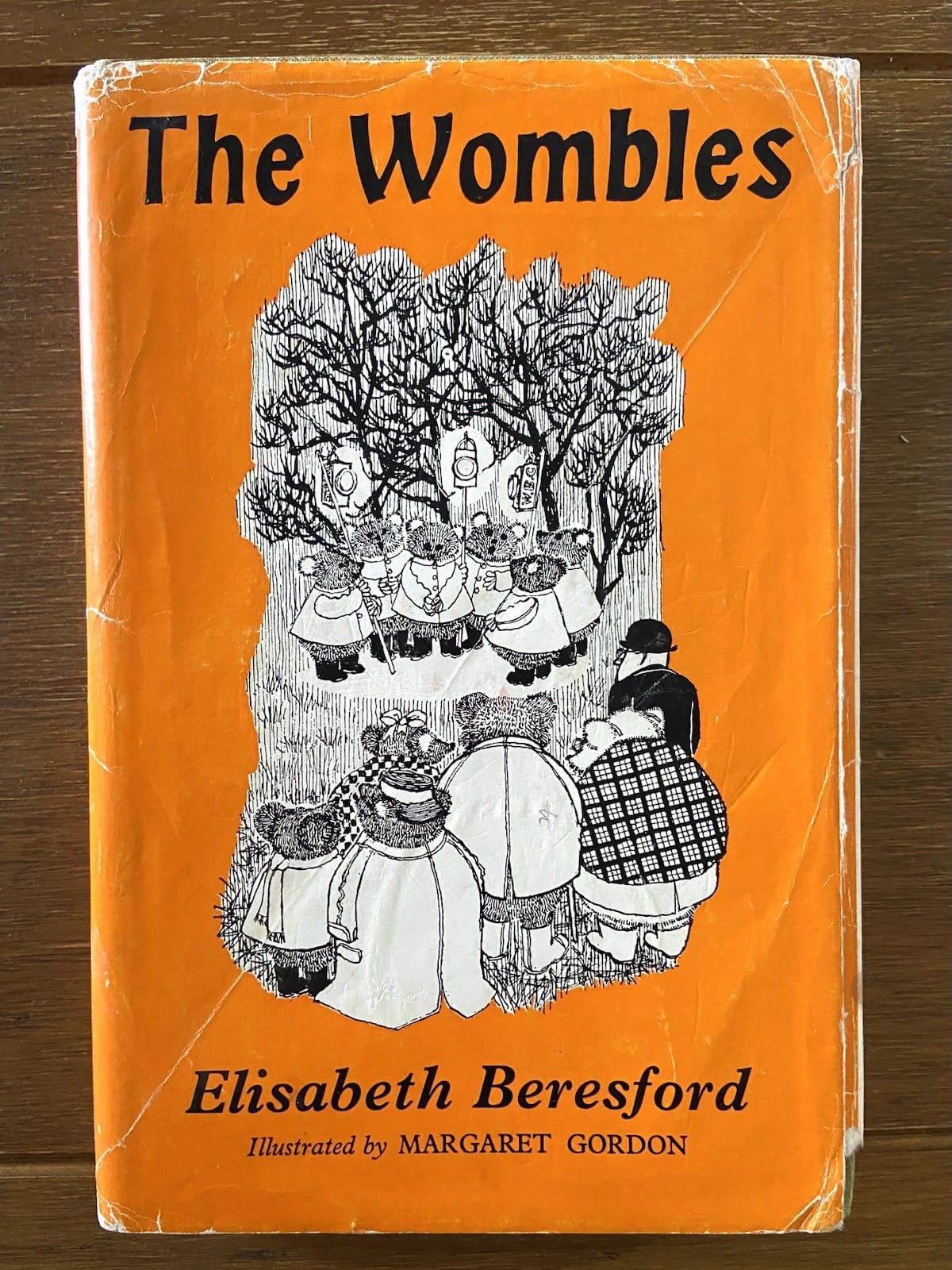
While in the Wild Thingz case study’s case (see newsletter 24) I managed to negotiated permission from its copyright owner to feature How&How’s branding to illustrate that case study. Unfortunately, for case study seven, the current owner of The Wombles intellectual property wouldn’t grant us the permission to feature How&How’s excellent work in my book. So you’ll have to go to the How&How website to see those rebranded wombles press images yourself.
While this was disappointing, it did afford me a new diagrammatic opportunity to illustrate mapping Semiosis onto existing creative commercial practice. I produced three new bespoke diagrams especially for this case study. Two of these new diagrams used the Design Council’s double diamond to map both Eilidh’s description of the process the creative team took, together with a fresh mapping of semiotic principles.
These diagrams helped to visualise the structural creative processes that are already semiotic in nature. Semiosis (semiotic sign-action) helps you navigate the creative minefields to visually communicate what you intend through the visual language you choose, as it involves the audience in your creative decision-making.
As Eilidh explains in both case studies (six and seven) the How&How team had to square the circle by understanding their target audiences to effectively communicate. She demonstrates how they developed the visual language to side-step creative minefields, to connect with each target audience through the chosen visual language.
Case study seven explores these potential creative minefields that lie in the path of the creative decisions you take. In it I map how applying pragmatic semiotic theory helps your design or illustration ideation to enhance how you visually communicate.
The Book
Semiotics for Designers and Illustrators is scheduled to be published in February 2027 by Bloomsbury Visual Arts. Check back to this newsletter for pre-ordering news and even discount codes …watch this space.
The Videos
Case study seven is also previewed in Semiosis 101’s season 5 episode 5.13 on Patreon and YouTube.
These Semiosis 101 season 5 video episodes will be published on my @Semiosis101channel over the next few months on YouTube. Or you can watch the entire season 5 of twenty Semiosis 101 episodes months ahead of YouTube with a Semiosis 101 Patreon subscription.
With a Patreon subscription you’ll also get a Semiosis 101 Producer credit on all future YouTube editions (plus other exclusive Patreon-only video content).