020: Spotlight on Case Study Four
Semiotics for Designers and Illustrators book newsletter #20
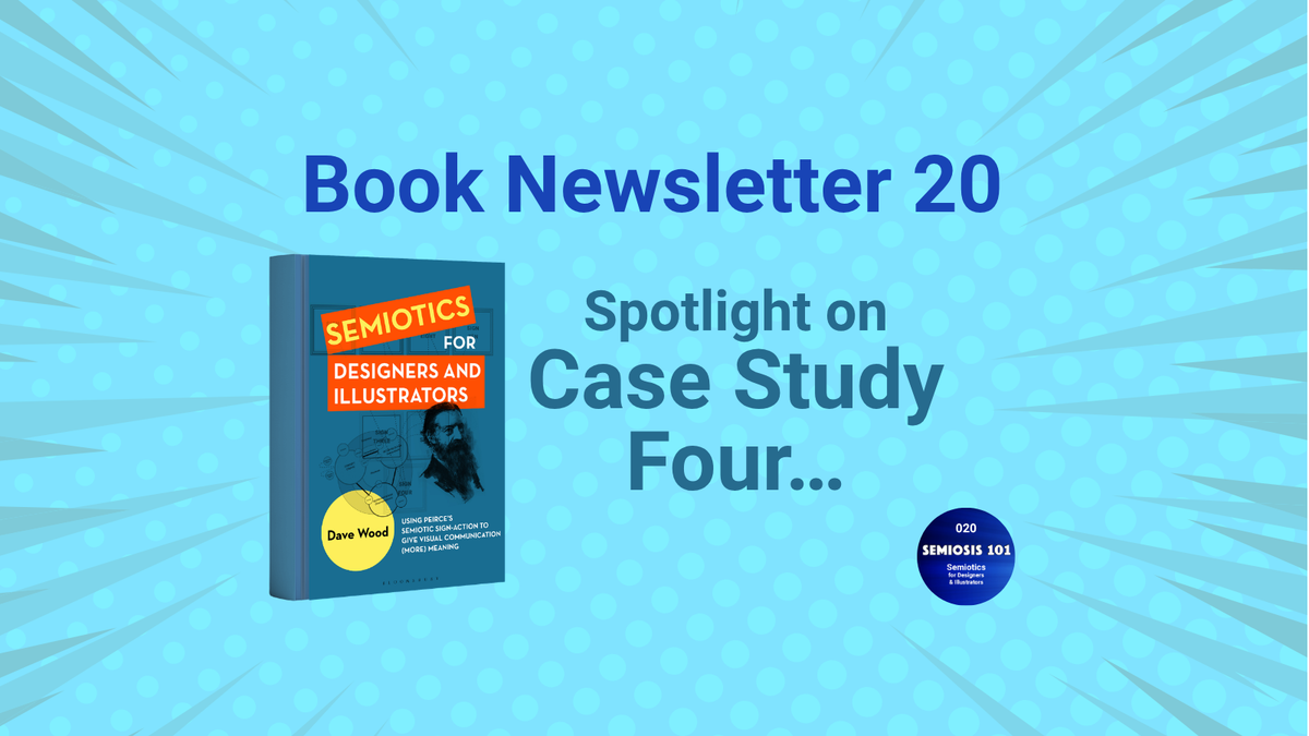
This newsletter puts the spotlight on the fourth case study in my 2027 Semiotics for Designers and Illustrators book. This case study’s title is A Class Action: Visually Explaining Peirce’s Ten Semiotic Sign Classes and it supports much of the theory in chapter four. In this case study I am visually supported by work kindly supplied by the two creators/copyright holders: Ben Heine’s Pencil vs. Camera 27 and Hudson Fuggle’s Waterloo Food Fortnight.
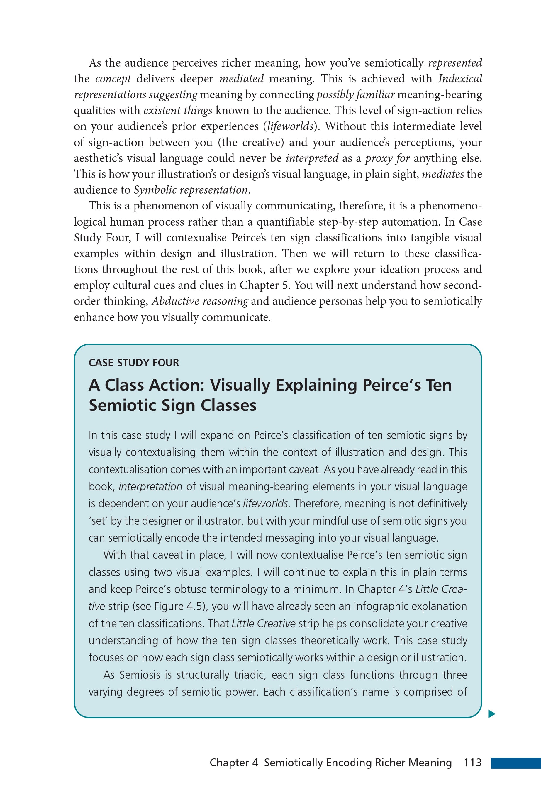
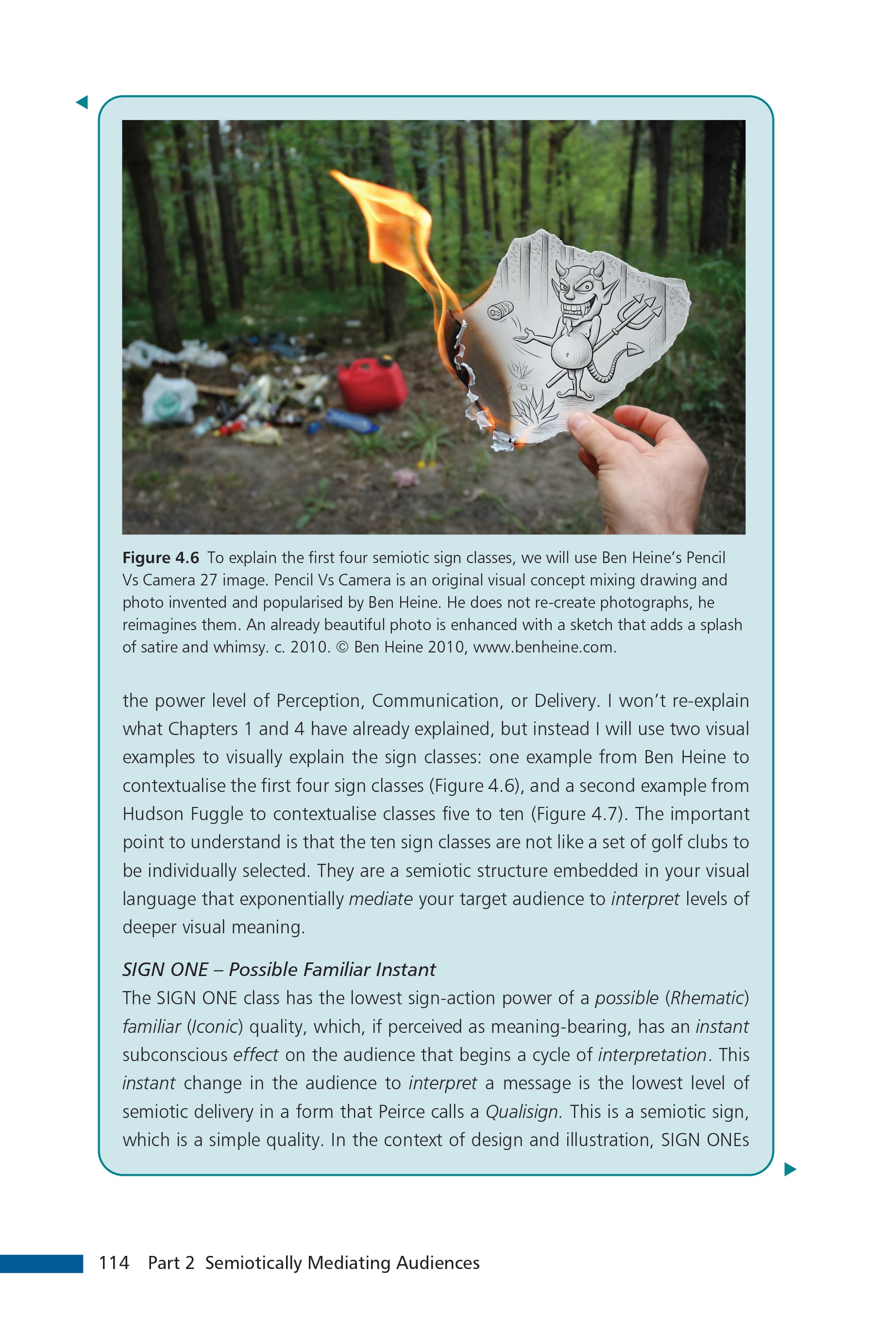
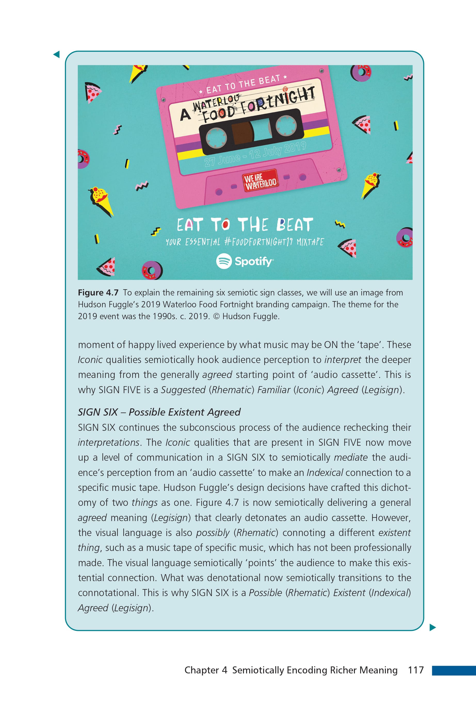
Selected pages from case study four. (m) Ben Heine’s Pencil vs. Camera 27 and (r) Hudson Fuggle’s Waterloo Food Fortnight. Used in the book by the kind permission of both copyright holders.
Case study four’s theme evolved from a request from my manuscript’s peer reviewers. They were eager to have more contextualising of Peirce’s ten sign classifications within visual communication outcomes. This case study’s genesis began during the writing of my PhD over a decade ago when I first tried to explain Peirce’s pragmatic semiotic theory to my non-Peircean PhD supervisors.
In its raw philosophical state, Peirce’s technical language can be terribly obtuse to non-theoreticians. Trying to explain the theory came across as obfuscation, as a) Peirce’s technical terms were created by himself, and b) I didn’t have a book that really explained Peirce in visual communication contexts (you can now see why I have written Semiotics for Designers and Illustrators).
In writing my PhD, it was my first attempt at explaining Peirce’s theory to non-theoreticians. In one section, I spent time explaining each sign class with a visual example. As this was my first attempt I wasn’t wholly satisfied with how I curated these examples. This section ultimately got relegated to an appendix to my PhD as I needed to edit the overall word count down. But as an appendix it did prove its usefulness with my supervisors and PhD viva examiners.
After the peer reviewer’s request, I revisited this PhD appendix and with a bit of re-editing and updating it became my book’s fourth case study. Instead of ten images (which was something that didn’t work in the PhD version) I decided to use one image to explain the first four lower sign classes. Then a different image to explain the six higher sign classes. Using ten visual examples subconsciously suggests separation, whereas by using only two visual examples it was easier to demonstrate the central point that weaker semiotic signs are nested within more complex semiotic signs.
As I stated earlier, my semiotic theory book is written in plainer language without dumbing down the rigour of Peirce’s amazing semiotic theory. Case study four is a pivotal moment in my book as it facilitates a shift from understanding theory to application of pragmatic semiotic theory.
The Book
Semiotics for Designers and Illustrators is scheduled to be published in February 2027 by Bloomsbury Visual Arts. Check back to this newsletter for pre-ordering news and even discount codes …watch this space.
The Videos
Case study four is also previewed in Semiosis 101’s season 5 episode 5.10 on Patreon and YouTube.
These Semiosis 101 season 5 video episodes will be published on my @Semiosis101channel over the next few months on YouTube. Or you can watch the entire season 5 of twenty Semiosis 101 episodes months ahead of YouTube with a Semiosis 101 Patreon subscription.
With a Patreon subscription you’ll also get a Semiosis 101 Producer credit on all future YouTube editions (plus other exclusive Patreon-only video content).