Free Semiosis 101 Transcript 4.2:
How Can CREATIVES Clearly Convey VISUAL Meaning?
Hello readers.
In this free transcript for the episode published on Semiosis 101 on Weds 19th March 2025, we are boxing clever with a way to understand how semiotic sign-action works. To understand how visual meaning-bearing is semiotically layered, we will focus on three pointers.
Watch the free episode on YouTube for the full impact…
…and here is the episode’s transcript.
How Can CREATIVES Clearly Convey VISUAL Meaning?
Yes, how can you designers and illustrators ensure that you clearly convey the visual messages you intend?
Our second of 20 questions will help you to understand Semiosis’ box of tricks. We will do this by framing how Peircean semiotic theory works in practice, by using a box metaphor developed by Roderick Munday. Okay, let us now lift the lid…
In this 2nd episode of Semiosis 101’s season four, we are boxing clever with a way to understand how semiotic sign-action works. Before we lift the lid on pragmatic semiotic sign-action, let us just consider a fundamental point of semiotics. The audience needs to interpret the concept that the creative is representing through the creative’s aesthetic crafting of the visual language they have chosen.
Charles Sanders Peirce asserts that nothing is a semiotic sign until interpreted as a sign for something. Therefore, you illustrators and designers are in a communicational situation WITH your target audience, to convey meaning within this triadic determination flow between… concept > representation > interpretation. You can think of the first two as what your client needs communicating, and the visual language you choose, where levels of meaning are semiotically layered. To understand how visual meaning-bearing is semiotically layered, let us focus on three pointers.
Firstly, every innocent mark you make has the potential to be meaning-bearing. These “marks” are the basic visual communication building blocks you already use. Peirce refers to weak, meaning-bearing qualities as Qualisigns. Qualisigns are effectively ephemeral visual semiotic triggers based on context and familiarities. They deliver a semiotic hint at deeper meaning.
If they are never triggered, then any encoded meaning remains dormant, yet in plain sight. If Qualisigns trigger the audience’s perception toward further interpretation (or not) the design or illustration remains aesthetically unchanged.
Secondly, semiotic signs are not tangible THINGS, they are elements within your visual language encoded to mean something to someone …only when perceived and interpreted.
These are two pointers, so what is the third?
Hopefully you have already grasped, from how I have explained Semiosis so far, that my third pointer is glaringly obvious? As designers and illustrators you have always been working semiotically! Just not with any structure.
To get our heads around the triadic (threes) structure of Semiosis’ determination flow let us focus on the concept. The “concept” is my designer-centric analogue term to Peirce’s more obtuse “Object.” For brevity I use the singular term, but a concept is stratified in the meanings (or messages) that needs to be communicated.
At a macro example level it is useful to think of concept as what your client needs your work to visually communicate. The client’s brief may give this, but any illustration or design will also have to consider at a micro level the tone of voice. If text is present in your design or illustration that will say one thing, but your design or illustration will provide further messaging about the concept.
We are not concerned with denotational meaning - This IS this! A whole page spread could communicate DOG, but the design and illustration would naturally provide more visual context to visually communicate the concept of DOG. The chosen visual language within the page spread’s aesthetic composition, would add personality, and other visual information associated with the concept of “DOG.” Such as breed, sex, nature, fur, size, energy levels, cuteness, fierceness, colouring, etc.
DOG still remains the concept, supported by visual clues that an audience can see. They may never perceive and interpret ALL the visual clues, but there will be enough in the page spread for everyone to interpret something.
How our concept example of DOG is visually communicated is up to the designer or illustrator. What information about DOG is interpreted is up to the audience’s lived experiences. What if the audience has no experience of such a thing as a DOG? Okay, I am being flippant here, but this is where the semiotic determination flow leads us to representation.
This is controlled by the creative, through the visual language they choose to visually communicate the concept to an audience. Let us stay with our DOG example to explore semiotic representation (I like dogs). In our hypothetical page spread, you can write DOG and people will read DOG. It will not be exciting.
As soon as you, as a creative, begin to consider how to creatively convey DOG, you are beginning to work semiotically. Is our DOG large or small? Is it hairy or sleek? Is it fierce or friendly? To visually communicate this you will use appropriate visual language to represent these qualities aesthetically. The marks, shapes, colours and qualities you select all have the potential to convey the message you want (or miscommunicate it).
You are used to doing this in your creative practice during ideation to arrive at the best solution. Whether you creatives have realised it yet, you are already (unconsciously) working semiotically. You are already encoding semiotic signs into your aesthetics that your audience can interpret as meaning-bearing. But are you aware of this? Semiosis means semiotic sign-ACTION.
By being aware of your target audience’s lived experiences, helps you craft your visual language to help the audience, to successfully interpret the intended concept. Semiotic “representation” is my designer-centric analogue term for Peirce’s more obtuse “Representamen” term.
Each of these three structures of Semiosis has an internal power structure from simple to complex. In representation’s case we semiotically have Iconic, Indexical and Symbolic representation levels. See the relevant YouTube playlists for further information. Or if you want to read more about these levels of power, then check out the Semiosis 101 Semiotic Resource on Semiosis101.online. Link is below in the description.
After representation comes interpretation. “Interpretation” is my designer-centric analogue term for Peirce’s more obtuse “Interpretant” term. This is the effect of the representation of the concept on the mind of the audience. Will they perceive and interpret the intended meaning? Or will they perceive from the representation a completely unintended meaning? Or completely fail to interpret anything.
Interpretation of what is perceived is dependent on the audience and their lived experience they bring to what they see. If they have no experience of a thing called a DOG, they obviously cannot be expected to understand what they see. No matter how well you creatives can visualise a DOG. Get my point?
If people do not know, they do not know.
Peirce refers to the act of interpreting as having three states: an Immediate state, a Dynamic state and a Final state. The Immediate state requires a sense of familiarity from qualities, as possible indicators to things already known to the audience. While there has been criticism in the design literature of semiotics excluding human agency, I make the case that Semiosis at least, that semiotic sign-action attends to an audience’s agency.
With a clear third of the triadic sign-action power aligned to audience interpretation, Semiosis is more than Semiology’s signifier and signified. As illustrators and designers, your representation of the concept has an effect on the minds of the audience. They have agency to interpret what they will. Semiosis helps to align that interpretation to the intended concept.
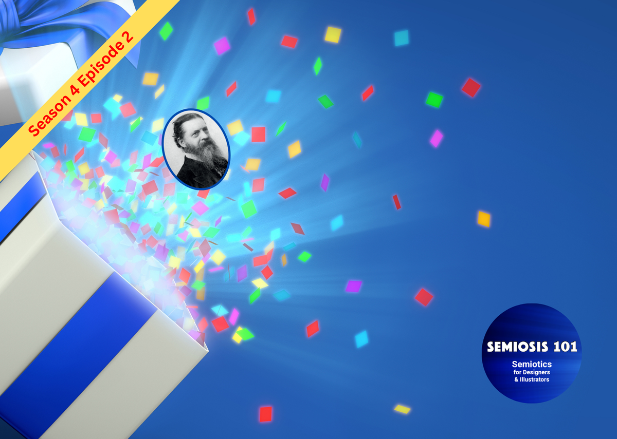
Finally we arrive at the box.
Roderick Munday coined this metaphor for Semiosis in Chandler’s book. I have found it very useful as a visualiser of what I have just discussed. So let us end this episode on the Semiosis box of tricks. We have a closed box with something inside it. We look at the box which provides us a visual clue to what is inside. We can then imagine what is inside.
But is it?
The box is the semiotic sign - the representation. What is inside is the concept. What we imagine is inside is the interpretation. In our mind’s eye, is what we imagine the concept or not? In our metaphor we open the box (interpret the representation) to discover playing cards (the concept). If we arrived at another interpretation then the representation has miscommunicated.
In the next episode we will focus on how a small perspective change in the creative, during ideation, can minimise miscommunications. Remember to subscribe to Semiosis 101 on YouTube to be notified when this is published.
Or become a Semiosis 101 Producer on Patreon and watch all future episodes months ahead of YouTube …plus a full redux episode archive, with other exclusive Patreon-only video content and a Semiosis 101 Publisher credit.
Hint… hint…
Semiosis 101 Semiotic Design Resources is a reader-supported publication. To receive exclusive posts and support my work, consider becoming a free or paid subscriber. Paid subscribers get name checked on all future Semiosis 101 YouTube episodes.
===Semiosis 101 Patreon Producer==============
Become a Semiosis 101 Patreon Producer and get a named producer credit on future video episodes, plus watch all new episodes months ahead of YouTube.
===Semiosis 101 Patreon Exclusives==============
Watch longer Patreon-exclusive Semiosis 101 episodes on applying Semiosis into design and illustration…
PATEXC001 How does semiotics work in illustration?