Free Semiosis 101 Transcript 3.19:
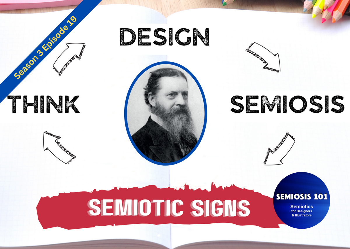
SEMIOTIC SIGNS: Think… Design… Semiosis…
Hello readers.
In this free transcript for the episode published on Semiosis 101 on Wednesday 30 October 2024, I reveal the application of semiotic sign-action within graphic design, using a design example from London-based design agency Hudson Fuggle. A big thank you to co-director Ian Fuggle for his support.
Watch the free episode on YouTube for the full impact…
…and here is the episode’s transcript.
“What do you mean that I have always been working semiotically?”
“This is the first time I have thought about semiotics!”
OKAY, calm down. If you are a visual communicator in design or illustration you work visually. Human’s are hard-wired to look for meaning in visuals. Creatives craft outcomes to visually communicate something to someone. Semiosis… semiotic sign-action …is the theoretical framework to enhance what you already do.
Let us now explore how with a design example.
Welcome to episode 19, the penultimate episode of Semiosis 101’s season three. In the last episode I explained the application of Semiosis in illustration. In this episode I will focus on the application of Semiosis with an example from graphic design.
Last episode I used illustrations I had created. This week I will use an example from London-based Hudson Fuggle, from their London Bridge City - Christmas by the River 2021 festival designs. A big thank you to co-director Ian Fuggle for permission to use Hudson Fuggle’s work as an example on Semiosis 101.
Before I continue I must caveat this episode. Unlike the illustration example where I discussed how I actually applied Semiosis; this episode will DECONSTRUCT where Semiosis is present. Hit subscribe to this YouTube channel, and I will explain…
Hudson Fuggle have a regular commission from Tower Bridge City to design and brand the theme for each year’s Christmas by the River festival by London’s famous Tower Bridge. In 2021 the festival theme developed into a storybook approach.
[Aside: Do you see any connections between last episode’s illustration example and this design example?]
So if you are sitting comfortably I will begin to tell a tale of TACIT application of Semiosis! I say TACIT as I know that the Hudson Fuggle designers …just designed. I did say at the beginning of this episode that you creative’s have always been working semiotically!
Do you also remember from past episodes, where I have discussed the semiotic determination flow? I have used a macro-level analogy of client > creative > audience to provide you with a familiar analogue. Well, to begin my tale of deconstructing where Semiosis is present in the design example. Let us begin with that macro-level analogy of client > creative > audience.
In Autumn 2021 Hudson Fuggle’s client, London Bridge City, commissioned the designers to “help bring the magic back to the capital’s largest free winter festival.” In semiotic terms, let us call this the concept to be visually communicated to the target audience. Contextually, Christmas 2021 was the first Christmas after the beginning of the 2020 Covid pandemic that people could mix again (in the open air).
The client’s concept of “bring the magic back” for Christmas was the challenge. The design team ideated lots of potential ways to convey this to Londoners and tourists, who now could socialise (still within Covid restrictions). The designers hit a big idea.
The Hudson Fuggle team created three woodland creatures – a robin, a fox and a stag – to represent the target audience. The way they decided to convey the client’s concept, was to use these three characters to represent the festival’s target audience. The big story to be told through the design work would be a re-emergence of society for Christmas 2021, from the shadows cast by 2020’s lockdown.
The three picture book characters were intended to “brighten even the darkest December day.” This representation to the audience of the concept would take the forms of animated films, environmental branding, competitions and social media content. A variety of different media formats for the visual communication of the client’s concept to entice the audience to physically visit the Tower Bridge City area.
So far, so good?
The three animal character’s designs utilised silhouettes of the familiar animal shapes. The animations and compositions gave the animal silhouettes a sense of existent reality, through their animated movements and composed presence.
To be technical here with Peircean semiotic terms, the Iconic representation of the animal shapes first provided a possible interpretation in the minds of the audience. Then once the audience were subconsciously satisfied they could identify the animals, the very same imagery begins to semiotically communicate at the next Indexical representation level as a robin, a fox or a stag. This movement from Iconic to Indexical representation is enabled by the audience.
The silhouettes do not change. Their meaning remains dormant in plain sight. A silhouette only visually communicates meaning if the interpretation has an effect on the mind of the audience. Hudson Fuggle’s representation of the client’s concept ultimately needed to lead to the desired action - to get the audience to visit the festival. Therefore the visual language of a fairytale was employed across the festival’s identity, print and digital engagement ideas.
In the previous illustration example I indicated where I applied Peirce’s ten classes of semiotic sign. So I will now deconstruct Hudson Fuggle’s design to demonstrate where these ten sign classes are also utilised. I say deconstruct, as the designers designed as they normally would. However, tacitly, they were working semiotically.
There are a myriad of visual qualities that create the tone of voice and context for “Christmas” and “Winter.” There are also a number of visual tropes that create a “storybook” and “fairytale” vibe. Each of these visual elements are meaning-bearing SIGN ONES.
SIGN ONES are instant hits of possible meaning from familiar qualities. The dark gradients from gold to violet are familiar qualities to twilight winter skies as the sun sets. The glistening golden yellows are familiar qualities to warm winter fires in the hearth (hand’s up who actually has a roaring fire anymore? Not many, eh?). These SIGN ONES’ job is not to visually communicate all the intended concept at once.
Peirce’s calls this instant hit of possible meaning a Qualisign. This is semiotically weak and ephemeral, and its purpose is to trigger perception so that interpretation of meaning can begin. Once a quality is perceived as possibly familiar to something, the semiotic signs begin to mediate. SIGN ONE hands over to SIGN TWO, in the minds of the target audience, when they think “winter.” However, the audience may interpret other meanings from a violet gradient!
The addition of other SIGN ONES in the gradient, in the form of white specs, could be possible stars. This nesting of semiotic signs with semiotic signs helps facilitate the audience to interpret meaning within a certain thematic latitude. So, if the audience of potential visitors are being successfully semiotically mediated, then SIGN THREE helps their interpretations to a possible existent thing e.g. winter sky.
The class of SIGN FOUR has been described as a sign of “direct experience.” The audience’s own lived experiences help them to subconsciously understand more of what the visual communications mean. Nothing has changed in the picture book visual language. However, the change is happening in the minds of the audience. The external signs mediating “sky” now continue internally.
The same graduated colours now, as a SIGN FOUR class, actually suggest in the audience’s minds a winter twilight sky. The audience have knowledge of the existence of “winter twilight skies,” so when mediated within the designs the audience are satisfied that this is not a summer festival.
SIGNS FIVE to TEN move mediation from mere possibilities and suggestions towards general socio-culturally agreed meaning. Let us end this episode by focussing on the robin, fox and stag in the context of these six sign classes. These animals are intended to carry the bigger message of emergence into a social world again.
The decision to silhouette the animals makes these characters general. The use of animal silhouettes in a city context create a possibly familiar agreed vibe [SIGN FIVE] of having travelled from somewhere else. Up to a point, the silhouettes may or may not be fully identifiable as existent animals, just shapes of possible animals.
If the robin hasn’t yet been interpreted as a robin, SIGN SIX still enables the audience to agree on “bird.” Once SIGN SEVEN helps suggest it IS a ROBIN, the audience can subconsciously agree the existential connection to winter and Christmas.
Classes SIGNS EIGHT to TEN utilise the nested lower level sign classes to ensure the audience generally accepts these animals are proxies for other things like ‘magic,’ ‘emergence’ and ‘visitors.’ Semiotically, as each audience member begins to realise the proxy meanings they perceptually move from possibilities [EIGHT] and suggestions [NINE] to finally resolved meaning [TEN].
In the final episode I will review all season three episodes. Patreon subscribers have access months in advance of YouTube to season four episodes.
Semiosis 101 Semiotic Design Resources is a reader-supported publication. To receive exclusive posts and support my work, consider becoming a free or paid subscriber. Paid subscribers get name checked on all future Semiosis 101 YouTube episodes.
===Semiosis 101 Patreon Producer==============
Become a Semiosis 101 Patreon Producer and get a named producer credit on future video episodes, plus watch all new episodes months ahead of YouTube.
===Semiosis 101 Patreon Exclusives==============
Watch longer Patreon-exclusive Semiosis 101 episodes on applying Semiosis into design and illustration…
PATEXC001 How does semiotics work in illustration?