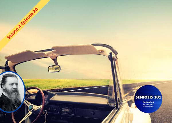
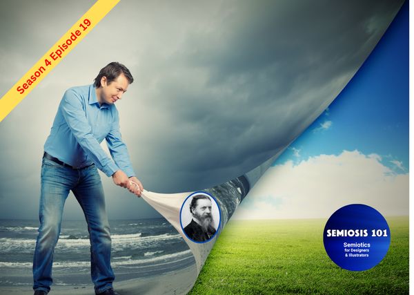
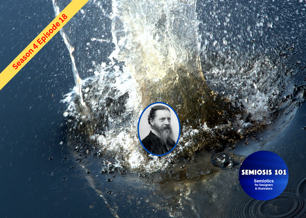
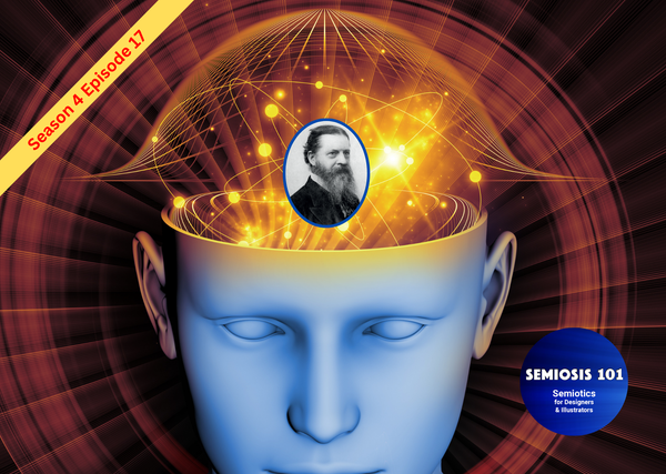
BLOG 05: Iconic Resemblances to SomeTHING
Semiosis 101 - 5 minute semiotic read
As visual communicators, your first visual communication task on behalf of your client is to get the attention of your target audience to look at what you have designed or illustrated.
If your audience does not spot something in the design or illustration that has a resemblance to something that they already know, something they are interested in, then they are going to “walk away,” and semiotics does not get a chance to start working. In order to HOOK their attention, as designers and illustrators, you can
only convey a possibility of making that connection by looking for shared qualities. Peirce refers to these as, “Like that thing and used as a sign of it.”
A semiotic sign at the Iconic level of representation of a concept is something that represents the thing the audience perceives.
At an Iconic level, interpretation begins. The audience will already be reading (on a subconscious level) many things into the visual stimuli around them. This is the visual noise that as designers and illustrators, you have to compete with for your audience’s attention.
As I have already stated, whether you realise it or not, your chosen visual language semiotically communicates all kinds of things to your audience. Intentionally or not. By missing this fact and not crafting the sign-actions taking place, you cannot ensure that the client’s intended concepts are being clearly visually communicated.
There is no point in crafting any semiotic representations of the concept in the visual language, by visualising things that the target audience have no connection to whatsoever.
We are talking here about tapping into audience feelings, and things that they have experienced.
Iconic representation is not just of things that are in existence. When I say Iconic building blocks of visual communication, I am referring to the lines, shapes, colours, etc.
With these Iconic elements we can begin to visualise, at a basic level, things that we know exist and things that we know don’t. This is in a socio-cultural context that our audience exists in.
When we put Iconic elements together, we juxtapose different things together. In these alignments and juxtapositions we craft basic visual elements in which meanings can emerge.
Since dawn of Homo sapiens’ existence, humans have had the ability for abstract thinking. Peircean semiotic theory of Semiosis just builds on that innate humanness’ ability to interpret patterns into a concept and meaning. Therefore, sign-action is the manipulation of those patterns into meaning.
When you begin crafting patterns of Iconic elements in particular ways, semiotic signs are created, hinting at something else - a bigger idea.
These patterns of Iconic elements to suggest a concept we semiotically move beyond denotatively saying, “THIS is THIS.“
Semiotically, at the Iconic level of representation of the concept at this basic level, we begin to say to the audience, “Hey, look at THIS.”
The Iconic elements resemble something the audience understands, but it is merely a visual hint and not the real thing.
We begin to HOOK their attention with the familiar, but in a way it is not immediately obvious. They may just be lines. Just lines, or colours, or shapes, or a combination that suggest “THIS is now THAT.”
When I say “resemble” what do I mean …semiotically?
Iconically it is working so far - semiotically speaking. But what are Iconic elements actually communicating?
Iconic elements are subconscious visual hints at bigger things that are suggested at this level of representation of the concept. A few brush strokes in red ink could resemble shapes of a shoe, a bridge, a bear, an atom or a planet. But they are just lines, shapes and colours.
If the audience did not know what a shoe, a bridge, a bear, an atom or a planet was, then the Iconic sign-action would have no power to begin working as semiotic signs.
This is why understanding the target audience’s collective experiences and knowledge will help you, as designers and illustrators, to semiotically begin crafting visual language that will HOOK the audience’s attention. To give the aesthetics time to engage them.